
Fall 2024
The long awaited rebrand project! One that many of us seniors were looking forward to, a chance to finally sink our teeth into something that felt a little bigger than what we have been tasked with previously. The rules were simple - 1) pick a mid-tier brand, that produces a physical product, no services, restaurants, etc and 2) No food products or makeup/skincare.
Earlier that year I had read what would become one of my all time favorite books - The Will of the Many by James Islington. I found the logo on the spine of the book a little strange - was it a goblet? With waves or hair going through it? I couldn't figure out the intent of the logo and as an avid reader I thought a publishing company would be fun to rebrand - so Saga Press was chosen and I began to sketch.

Saga Press's Current Logo
Starting Sketches
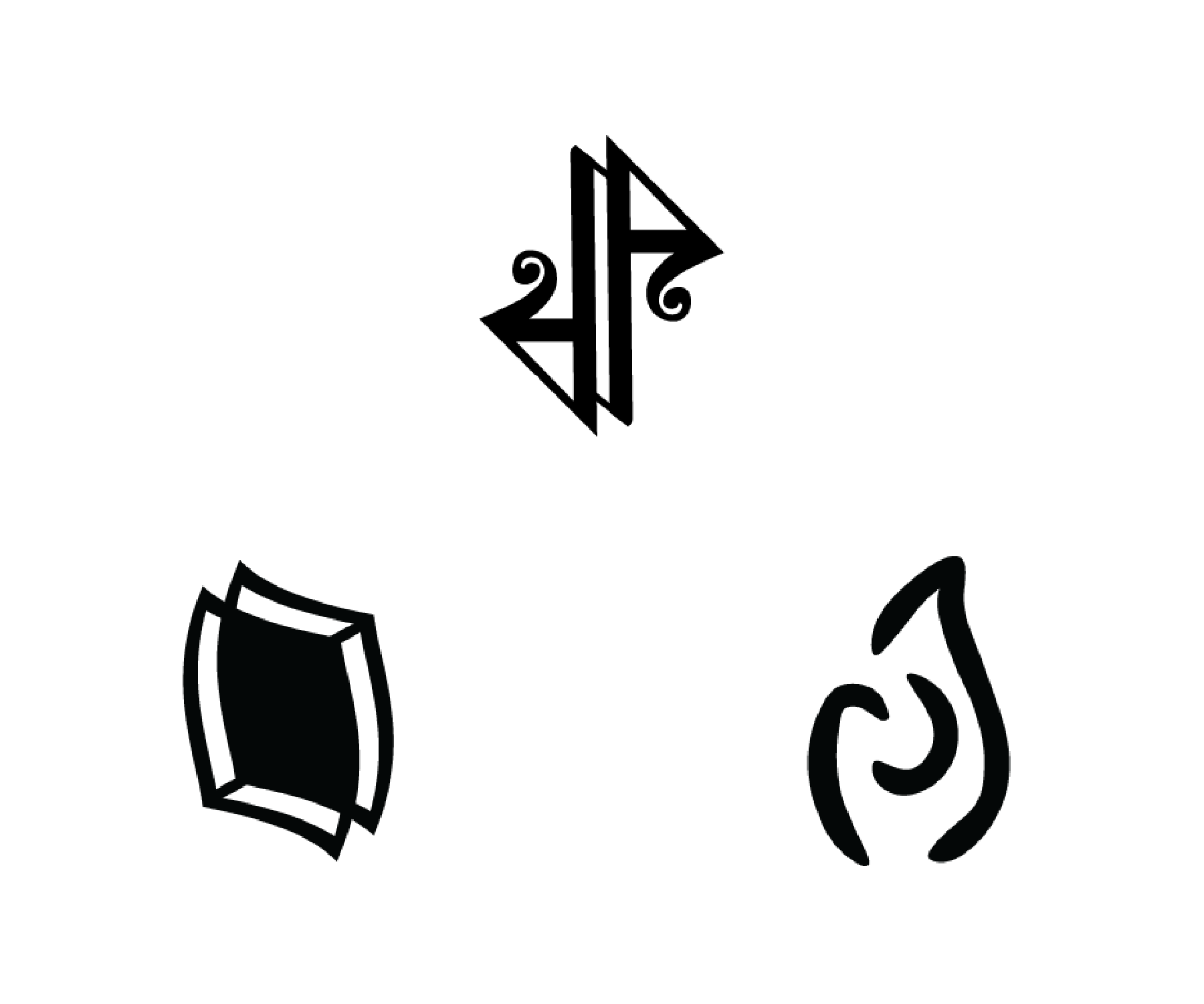
Refined Sketches
Process
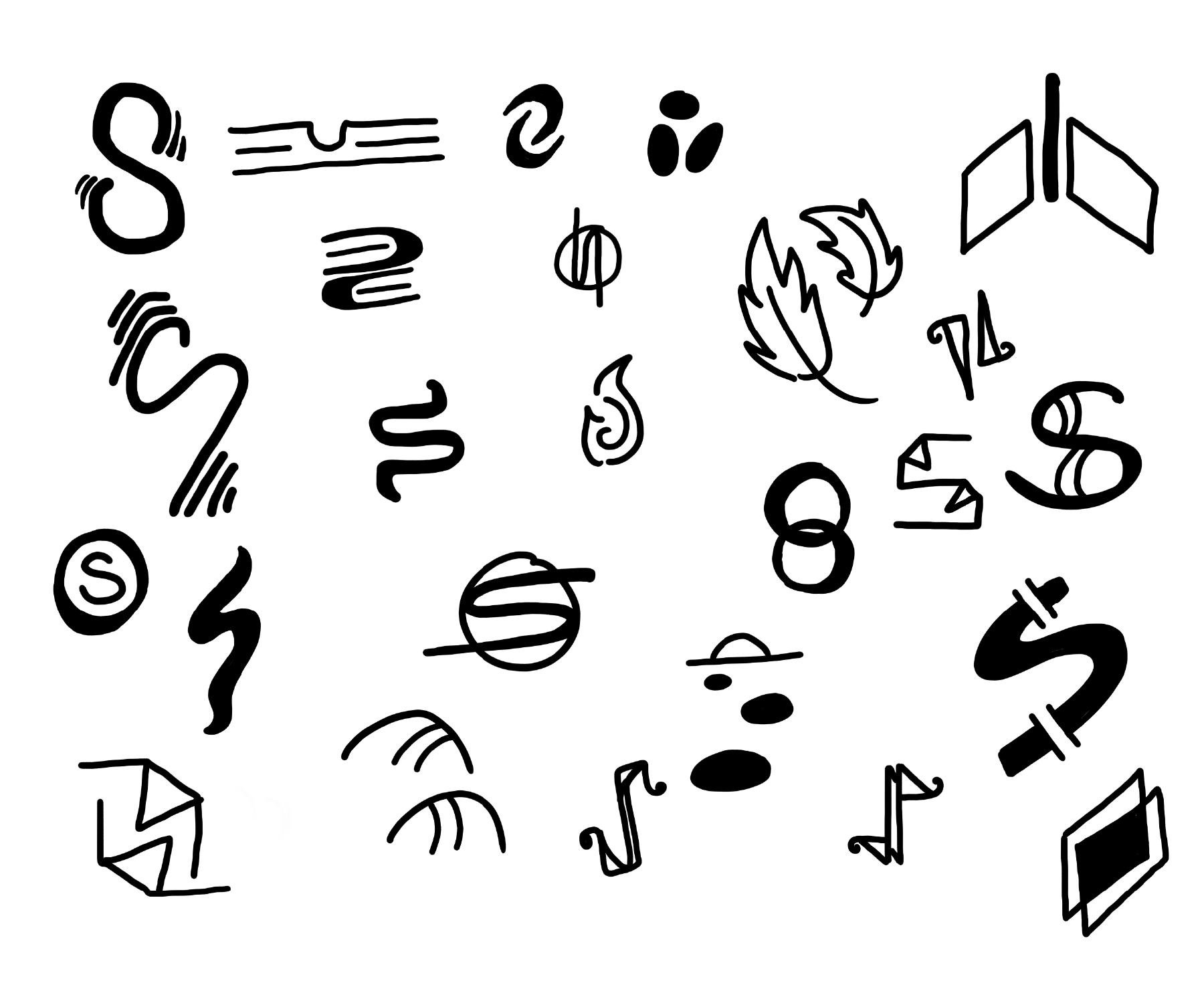
I took my sketches in three main directions, 1) a play on the letter "s", 2) an abstract shape that incorporated at least two repeating shapes and 3) an icon that represented the idea of adventure (flame, pathways). I knew that Saga Press prided themselves on featuring diverse voices and many of their books deal with heavy topics, often political in nature. I liked the idea of a blackletter inspired S - because it felt both "book-ish", inspired by old literature as well as radical and alternative. I wanted to be blunt about the heavy themes in the books because many of them call for change and progression. The top logo in my refined sketches was closest to this idea. Though, in that moment, it felt a little overly complicated. It also resembled a music note to many of my peers and I knew that would send the wrong message. So I made more S's, many, many more S's. Below is a small sampling of the S sketches.
I took my sketches in three main directions, 1) a play on the letter "s", 2) an abstract shape that incorporated at least two repeating shapes and 3) an icon that represented the idea of adventure (flame, pathways). I knew that Saga Press prided themselves on featuring diverse voices and many of their books deal with heavy topics, often political in nature. I liked the idea of a blackletter inspired S - because it felt both "book-ish", inspired by old literature as well as radical and alternative. I wanted to be blunt about the heavy themes in the books because many of them call for change and progression. The top logo in my refined sketches was closest to this idea. Though, in that moment, it felt a little overly complicated. It also resembled a music note to many of my peers and I knew that would send the wrong message. So I made more S's, many, many more S's. Below is a small sampling of the S sketches.


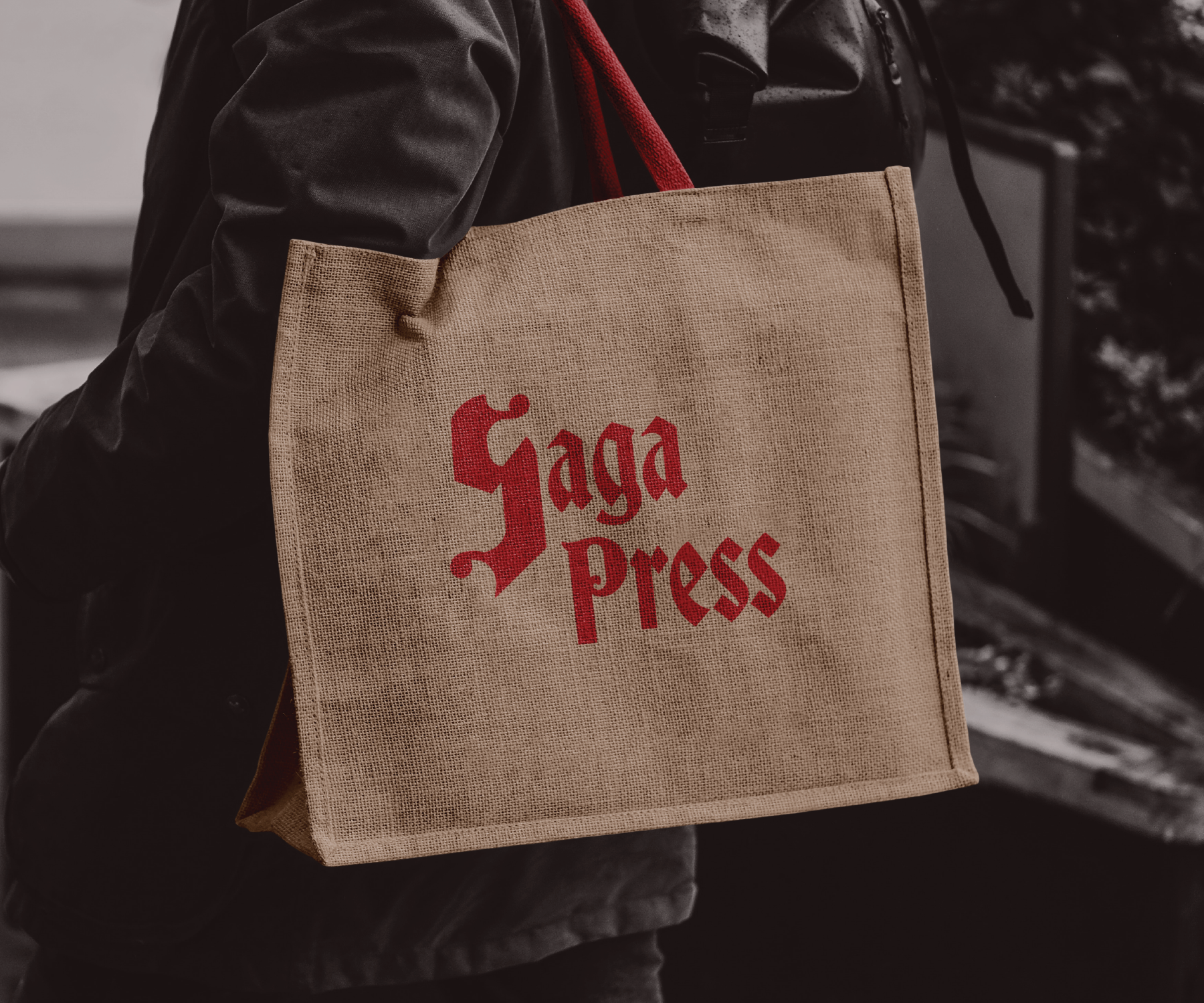
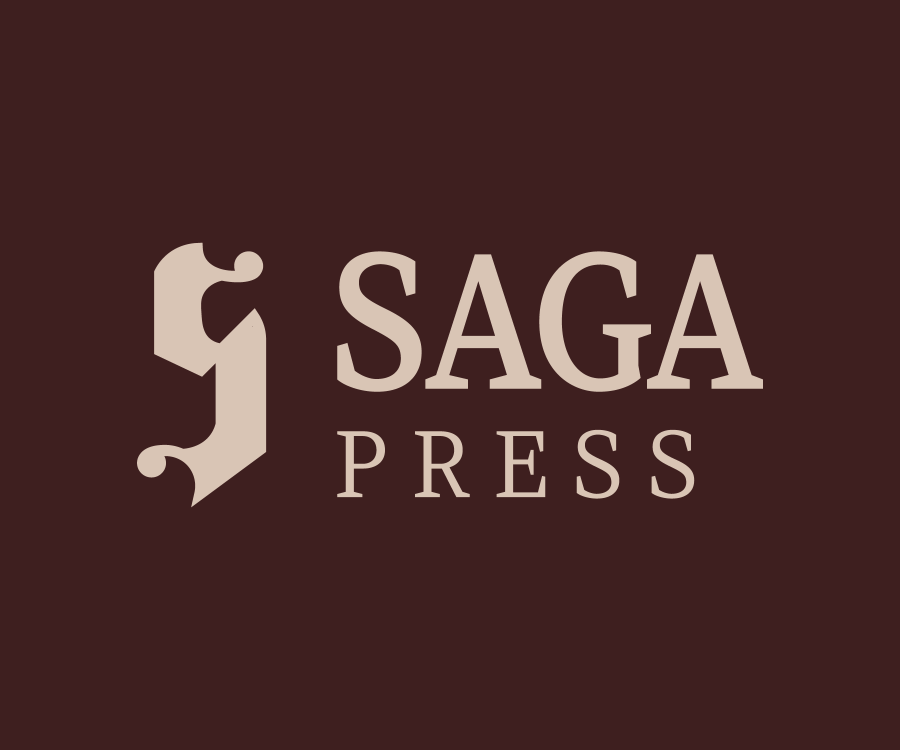
Final Product
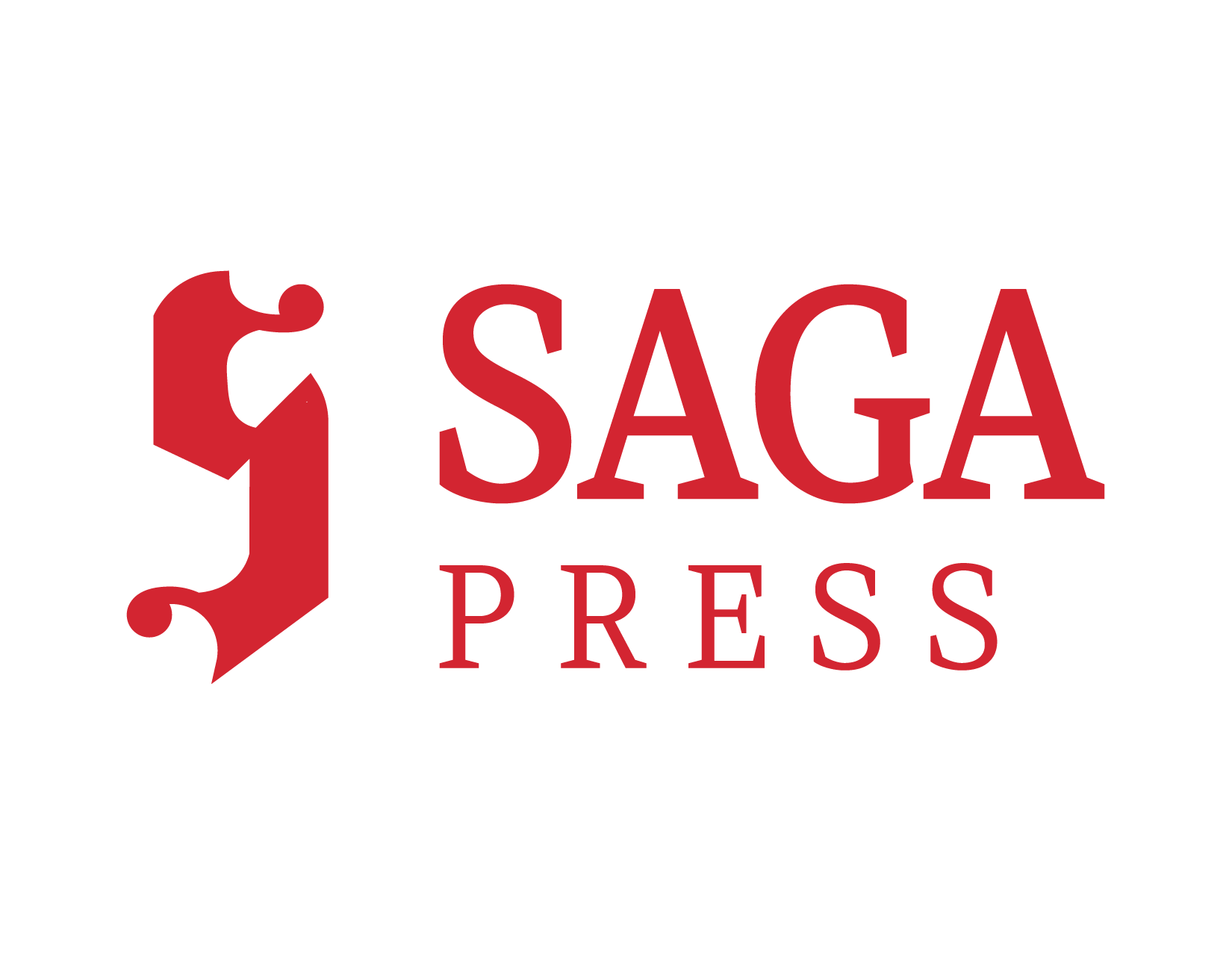
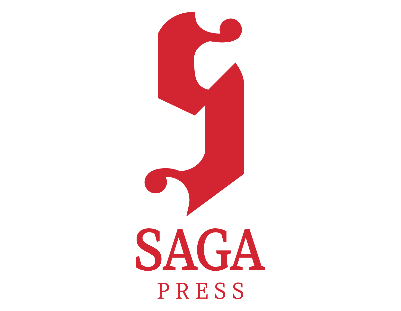
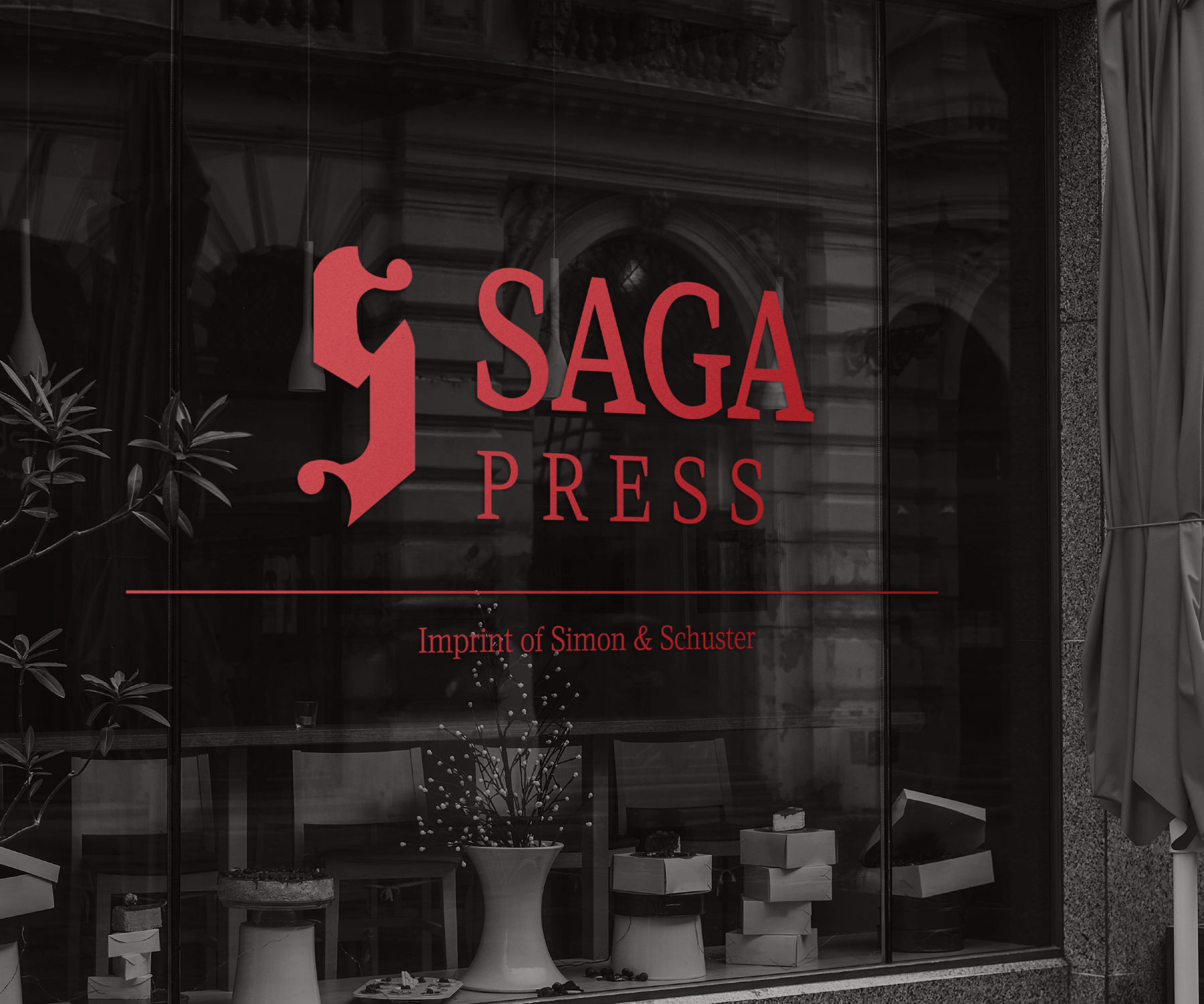
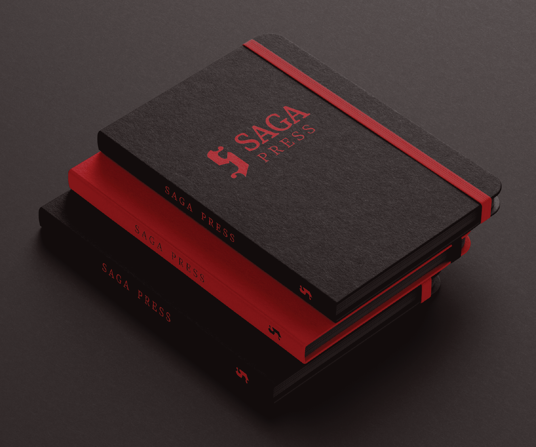
I ended up with a simple yet bold blackletter inspired S as the main logo-mark, intentionally left tall in order to best utilize the vertical space on a book spine. The goal of the logo is to inspire readers to indulge in books by diverse authors and utilize the thought provoking themes in these books to enact real world change.
I ended up with a simple yet bold blackletter inspired S as the main logo-mark, intentionally left tall in order to best utilize the vertical space on a book spine. The goal of the logo is to inspire readers to indulge in books by diverse authors and utilize the thought provoking themes in these books to enact real world change.