
PROJECT story
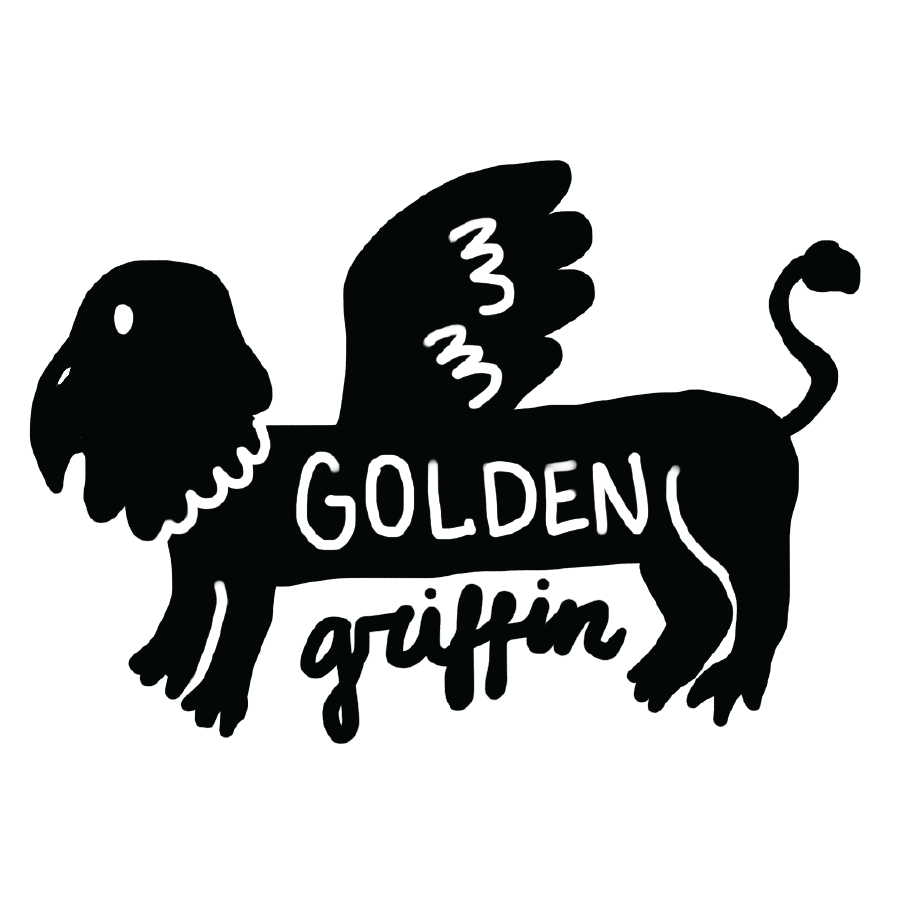
Designers sometimes need to work with companies with unique, strange or imaginative names. The challenge for this project was to create a logo-mark and packaging for a fictional Portland based brewery - with a name provided to us at random. Part of the ask was also to create branding that felt humorous, lighthearted, fit nicely on bar taps and overall reflected the values that a small craft brewery might have as opposed to a large national chain. I felt good about the company name I was given at random - Golden Griffin. Alliteration is always fun and I thought that the name gave a good opportunity to develop a brand mascot.
PROCESS
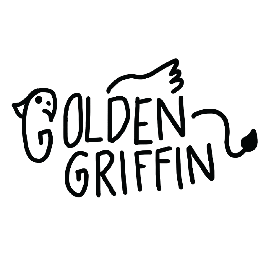
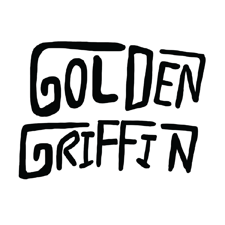
I started playing around with typographic lockups that included a griffin in some way. Ultimately I felt that these options were trying to stuff too many elements into one and ended up favoring the idea of a separate mascot and type lockup.
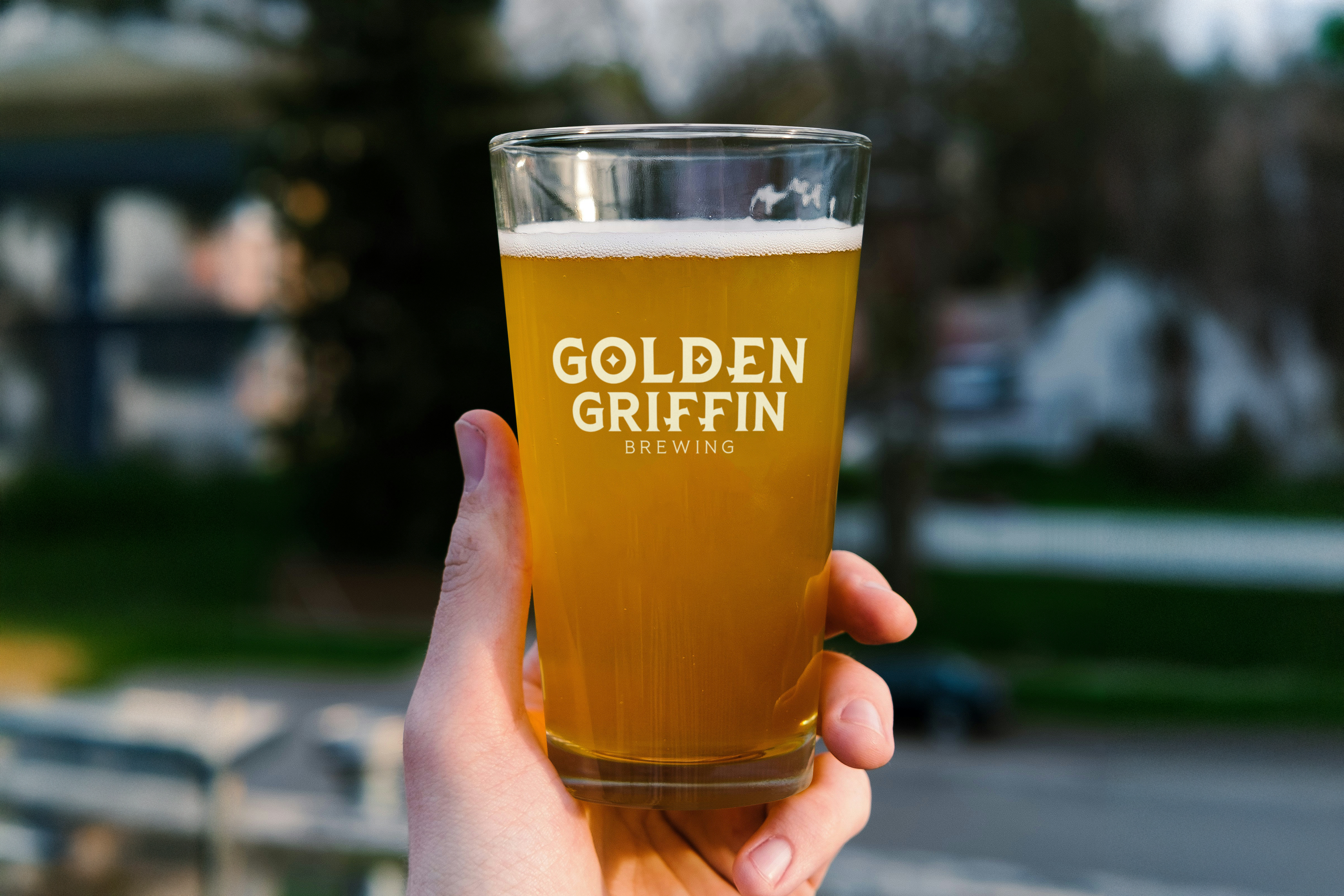
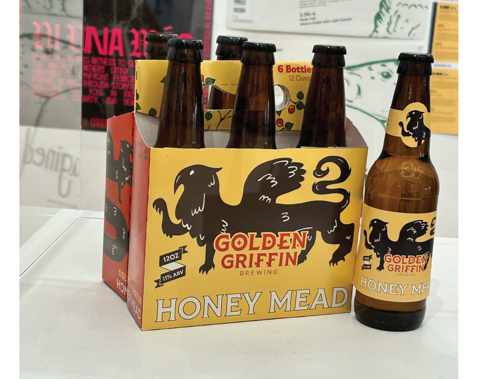
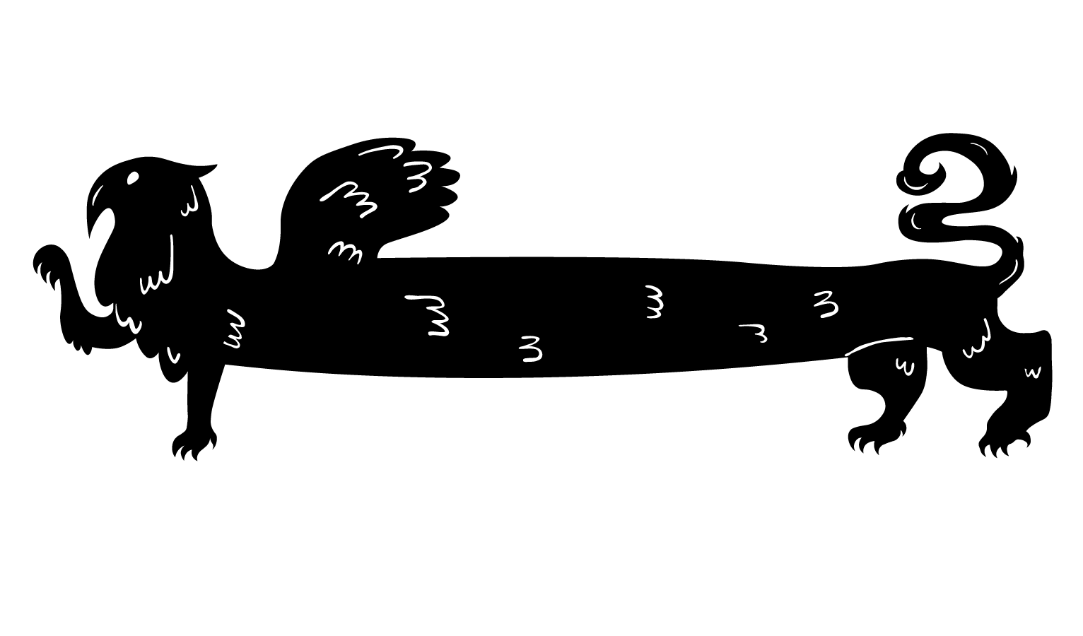
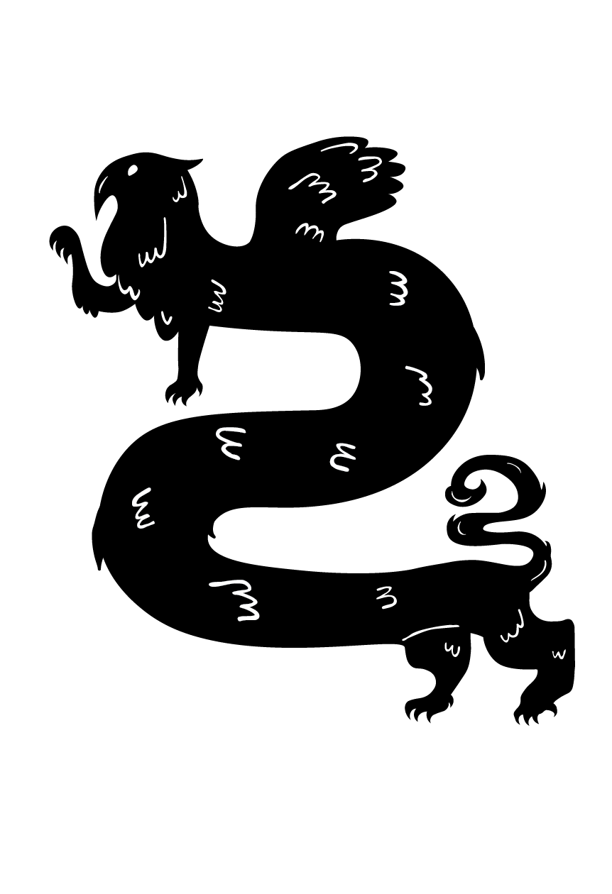
To play into the humorous aspect of the brief, I came up with the idea to have a modular griffin, one that could be stretched and curled into many playful shapes. In this way the griffin could be posed in various funny ways but also easily fit on any type of product, whether it be beer cans or bottles, bar taps, flyers, or whatever it is that the brand may need or want.

FINAL PRODUCT
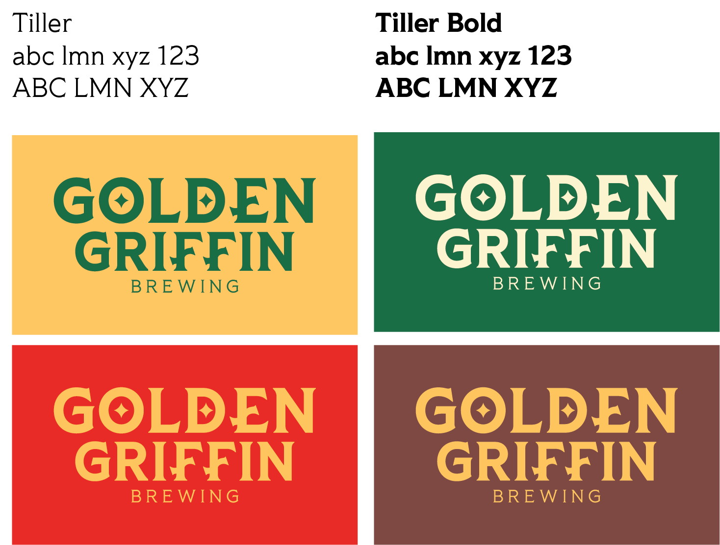
Once the griffin was developed I knew that I wanted to incorporate more of the “golden” part of the brand name into the logo. Keeping it simple was important, as I wanted to ensure that the whole look was bold and eye-catching for store shelves. I used the base font Tiller and tweaked the bars on the E and F’s to give the logo more movement as well as add the idea that the words could be “shimmering”. Then as a final touch, the stars inside the O and D where added to emphasize the golden part of the brand.
Overall, the project did well and was even showcased in the gallery of our Art and Graphic Design building!